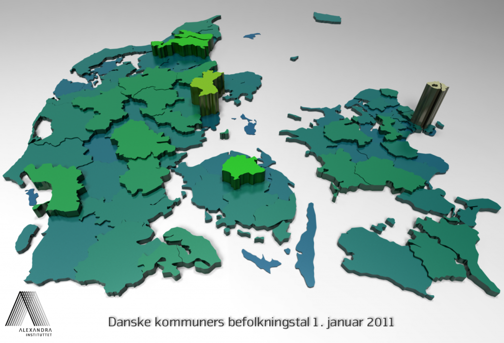
 Recently the Danish Ministry of the Interior and Health published a lot of key figures about Danish municipalities on a new web page ( http://www.noegletal.dk ). We put a little effort into making a pipeline capable of turning all those numbers into nice graphics. The figure seen above is an example of what our software can do. It is basically a bar diagram where each bar (or ‘brick’) is a municipality and the bar height and color encodes a quantity – here the population figure is shown.

